Mobile Image Optimization: Performance for Every Device
Optimize images for mobile devices with responsive techniques, adaptive loading, and device-specific formats. Improve mobile performance and user experience.

Mobile devices account for over 50% of web traffic, making mobile image optimization crucial for performance and user experience. Learn techniques to deliver the right image to the right device at the right time.
Mobile-First Image Strategy
Design your image strategy around mobile constraints: limited bandwidth, smaller screens, touch interfaces, and battery life considerations.
Responsive Image Techniques
Use srcset and sizes attributes, picture elements for art direction, and CSS media queries to serve appropriate images for different screen sizes and resolutions.
Progressive Loading Strategies
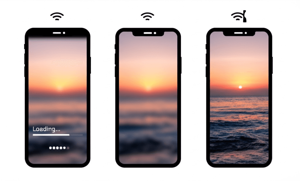
Implement lazy loading, progressive JPEG encoding, blur-to-sharp transitions, and skeleton screens to improve perceived performance on mobile devices.
📱 Optimize for Mobile
Use ConvertifyHub's mobile optimization tools to automatically generate responsive image sets optimized for every device and connection speed.
Related Articles

The Complete Guide to Modern Image Formats: WebP, AVIF, and Beyond
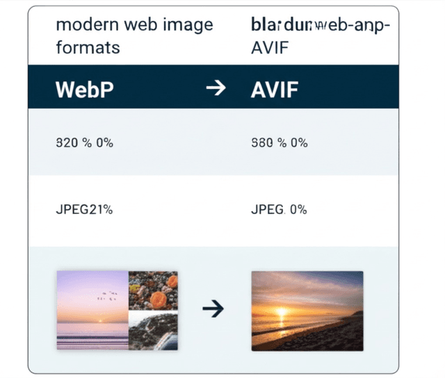
Discover the latest image formats that can reduce file sizes by up to 50% while maintaining superior quality. Learn when and how to use WebP, AVIF, and JPEG XL.

Image Batch Processing: Automating Your Workflow
Streamline your image processing workflow with advanced batch operations. Learn to resize, convert, and optimize hundreds of images simultaneously while maintaining quality.

Color Space Conversion: Managing Digital Color Accuracy
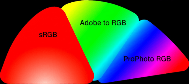
Master color space conversion between sRGB, Adobe RGB, ProPhoto RGB, and CMYK. Ensure accurate colors across different devices, media, and printing processes.
Stay in the Loop
Get weekly insights on file conversion, optimization tips, and industry trends.
The Complete Guide to Modern Image Formats: WebP, AVIF, and Beyond
Audio File Conversion: From Lossless to Streaming Formats
QR Code Generation: Best Practices and Advanced Techniques
PDF Optimization: Reducing File Size Without Quality Loss
Video Format Conversion: From Legacy to Modern Codecs
Community Stats
Article Details
Related Tags
Ready to Master File Conversion?
Join thousands of professionals who trust ConvertifyHub for their file conversion needs. Start exploring our comprehensive guides today.